


The Quarterly Q2 2025

Welcome to the 3rd quarterly retrospective for The Budgeting App! In these posts, I’ll share a snapshot of what happened last quarter, reflect on our work and achievements, and outline our plans for the months ahead.
Part 1: The Numbers
I’m going to try something new and write this section live. It’ll give you a better idea of what I’m actually doing, but it might be a bit over the place. Let me know if you find this more interesting to read :)
Nat and I have been deep in open banking development lately. During this time, I’ve only been doing quick, surface-level health checks on the app:
My Daily Check-in
I open our Grafana dashboard and take a quick look at a few key stats:
In the last 30 days, 9759 people have downloaded and installed our app.
We’ve sold 273 new paid subscriptions in that time.
Our active subscriber base has grown by 33% over the past quarter.
Surface-level diagnosis:
New users are continuing to join, and acquisition is trending up ✅
Subscription sales are increasing ✅
Our active subscriber base is growing ✅

This is a new graph I added, and I’ve casually been watching it over the last three months. It shows the number of new paid subscribers in the past 24 hours. Green is the total, blue is Android, and purple is iOS.
The trend I’ve noticed: More people tend to subscribe later in the week. Things quieten down from Sunday, then slowly pick back up midweek.
Interest in Open Banking
Since we’ll be spending a lot of time working on this feature, let’s take a look at the latest open banking survey results.
“How interested are you in linking your bank account to automatically track your spending and income?”
Very interested - 25.6%
Interested - 24.2%
Unsure - 13.5%
Not really interested - 16.4%
Not interested at all - 20.3%
Last quarter, around 40% of users were interested/very interested in the feature. Now that we’ve collected more data, that number’s closer to 50%… even better!
User Retention vs Industry Average
A little while ago, Nat did a quick comparison of our app’s user retention against general finance apps. Let’s take a look at the latest data for this quarter:

Day 1: 22.7% (them) vs 19.9% (us)
Day 7: 10-15% (them) vs 7.8% (us)
Day 30: 5.8% (them) vs 4.1% (us)
A couple of things to keep in mind:
User retention measures the percentage of new users who return to the app on each day, regardless of subscription status.
The industry averages include banking apps, which likely push the numbers up.
In any case, we can still do better.
Paid User Retention
Let’s look at paid user retention for monthly subscribers, as this was one of the problem areas I flagged in our last quarterly review.
To do this, I run a script that analyses purchase data from our database.
The first thing I noticed: The user count for the June 2025 cohort is about 40% lower than the “new paid subscriptions in the last 30 days” figure I shared earlier in the Daily Data Check-In section. That doesn’t make sense. These numbers should match. The number of subscriptions sold in the last 30 days should be the same as the new subscriber count for June, which should also be the June cohort size.
So one of these numbers is wrong.
I’m going to double check my code for both, while prompting AI to do the same (side note: I started using Cursor AI last quarter and it’s been amazing).
My retention code looks good. Gemini quickly pointed out the real issue: A bug in my “new paid subscriptions” logic. I was mistakenly counting renewing subscriptions as new… oops. The stat in the Daily Data Check-In should actually be:
In the last 30 days, we’ve sold
273167 new paid subscriptions.
This also means the “Daily New Subscriptions” graph is off, since it includes renewals. Unfortunately, I can’t retroactively fix the graph, so we’ll leave it as is for now.
Moving on, the graph below shows monthly paid user retention, grouped by quarter and averaged across cohorts. There’s a slight improvement in retention for months 2 and 3, but I’m not confident enough to call it a trend just yet.

Testing Paid User Retention Hypotheses
This is something we’ve wanted to do for months, ever since one of the mentors in the Founder Catalyst programme suggested it.
How this works:
Break paid users into monthly cohorts.
Form a retention hypothesis.
E.g. If a user adds ≥20 transactions within 30 days, they’re more likely to renew.
Gather and analyse data.
E.g. We found that in the May 2025 cohort, 65% of users who added ≥20 transactions renewed.
Repeat steps 1-3 to find behaviours that lead to ≥70% renewal.
Once we succeed at step 4, we’ll have a set of actions we can nudge users towards to improve retention.
It’s taken a while to get here because we first had to sort out how we collect, organise and analyse our data. Before this, Nat was collecting client-side data via events in Google Analytics (GA), while I was collecting server-side data in our database. Nat had everything related to in-app behaviours and I had the subscription data.
To analyse retention effectively, we needed a single source of truth. So we decided to send all relevant server-side data to GA, and then export both client and server-side events into BigQuery for analysis.
I started sending subscription data to GA in late April, which means monthly subscribers in the May 2025 cohort have gone through one full billing cycle, perfect for our first round of testing.
Hypothesis 1: Adding Transactions
Theory: Users that add transactions gain more value and are more likely to renew. This seems obvious, because without transactions, it’s impossible to get value from the app. A simple, logical first hypothesis to test.
For monthly subscribers in the May 2025 cohort:
>= 5 transactions within 30 days:
25.0% excluded (missing renewal/cancel event).
Of the remaining:
73.8% renewed.
26.2% cancelled.
>= 20 transactions within 30 days:
20.6% excluded.
Of the remaining:
77.8% renewed.
22.2% cancelled.
Takeaway: Users that gain value from the app are more likely to renew, and adding transactions is a key part of unlocking that value. Whether they add transactions because they see value, or they see value because they add transactions, it’s clearly a core behaviour.
We already encourage this behaviour in a few ways, for example:
A big “+” button on the home screen.
A fast, simple add transaction screen.
Daily 8pm reminders (on by default).
Hypothesis 2: Customising Categories
Let’s try something less obvious.
Theory: Users that customise the app are more likely to feel a sense of ownership and engagement, which should lead to better retention. One of the simplest ways to personalise the app is by adding or editing categories (especially when choosing icons for custom categories).
One thing I’m not sure about when testing this hypothesis is the timing of the add/edit category events. I’m considering two approaches:
Count events before the user’s renewal date (i.e. anytime after account creation).
Count only events that occur after subscribing, but before renewal (similar to the approach used for the transaction hypothesis).
The issue with method 2 is that a user might customise categories before subscribing, and that could still impact their decision to renew (but those users wouldn’t be included in the test).
So, should I include or exclude pre-subscription events?
I asked ChatGPT o3, and since the goal is to test whether nudging category customisation improves retention, the advice was to use method 2:
“Pre-subscription behaviour is a lagging signal of past engagement, not a leading signal you can influence once they are paying.”
“Mixing pre and post sub events blurs causality”
Makes sense.
For monthly subscribers in the May 2025 cohort:
>= 1 category add/edit post-subscription:
24.6% excluded (missing renewal/cancel event).
Of the remaining:
55.8% renewed.
44.2% cancelled.
>= 7 category add/edit post-subscription:
21.1% excluded.
Of the remaining:
70.0% renewed.
30.0% cancelled.
Takeaway: There appears to be a meaningful link between customising categories and retention, especially when users go beyond the basics. While not as essential as adding transactions, this behaviour suggests a deeper level of engagement.
Also worth noting: Eyeballing the data, there appears to be overlap between users that retained in this hypothesis and the previous one. Many of those that added >=20 transactions also added or edited >=7 categories. This supports the idea that users who interact with multiple parts of the app, and shape it to fit their needs, are more likely to stick around.
Hypothesis 3: Viewing Analytics
Theory: Users that regularly check their analytics may be more engaged with their spending habits and, as a result, more likely to retain. If users are reviewing their data, they might be getting ongoing value from the app (or at least showing continued interest).
For monthly subscribers in the May 2025 cohort:
>= 1 visit to the analytics screen post-subscription:
21.6% excluded (missing renewal/cancel event).
Of the remaining:
69.0% renewed.
31.0% cancelled.
>= 4 visits to the analytics screen post-subscription:
9.1% excluded.
Of the remaining:
70.0% renewed.
30.0% cancelled.
Takeaway: There appears to be a correlation between viewing analytics (at least once) and retention. However, the cohort size for the >= 4 views group was about 1/3 the size of the other tests, suggesting most new subscribers don’t view the analytics screen very often.
This could mean the analytics screen isn’t a major source of value for new users, or it might simply reflect a smaller segment of more data conscious users. Either way, I think it’s a weaker signal compared to adding transactions or customising categories.
Overall Retention for May 2025 Cohort
It’s helpful to compare the above results with overall monthly subscriber retention.
For all monthly subscribers in the May 2025 cohort:
52.9% renewed.
47.1% cancelled.
Users that added >= 20 transactions within 30 days were 47% more likely to renew. That’s huge!
Conclusion
The data shows only a small gap between the three behaviours, but logging transactions still feels like the strongest lever. It’s the most direct path to daily value: No data = no value.
To improve retention, we should focus on encouraging this behaviour and finding ways to help users turn it into a habit using our app.
It’ll be interesting to see how open banking changes this dynamic. Once transactions are imported automatically, which behaviours will replace manual entry as the key predictor of retention?
Part 2: Highlights from Last Quarter
Savings and Loan Trackers

Last quarter’s big release was the Savings & Loan Trackers feature. Until then, our app focused only on short-term budgeting; we didn’t have any features that supported long-term goals. Our onboarding survey showed:
49.7% of users are saving for something expensive, like a holiday or house.
33.4% want help paying off loans.
Supporting those goals also aligned with our 2025 aim to improve retention. If people track their big financial goals in our app, they’re more likely to stick around.
How we shipped it
Front-and-centre placement: This feature got its own tab on the bottom nav for easy access and constant visibility.
Extra polish and fun: A simple list with progress bars felt a bit dry, so we added a fun animated view that changes as you make progress.
Onboarding hook: If a newcomer selects “saving for something expensive” or “paying off a loan” in the onboarding survey, we show a prompt encouraging them to set up a matching tracker.
Here’s how that performed in June 2025:45.8 % of new users saw this extra step.
75.4 % of those began setting up a tracker.
71.2 % completed setup.
Free vs paid
We debated whether to lock this feature behind our pro subscription, since we already offer a lot for free. In the end, we landed on this:
Free: 1 tracker.
Pro: unlimited trackers.
Our reasoning was that letting every user set one long-term goal should improve retention, while most people serious about personal finance will have multiple savings targets or loans to pay off (e.g. home loan + emergency fund).
Early usage
Here are the usage stats for June 2025:
All new users: 33.6% created at least 1 tracker.
New subscribers: 60.5% created at least 1 tracker.
We’ve had zero direct feedback so far, which could mean everything’s working as expected, or that people haven’t spoken up (or don’t care enough to). That said, the adoption numbers look good, especially among paying users. As more data comes in, it’ll be interesting to see whether subscribers who use trackers are more likely to renew than those who don’t.
New Profile Screen
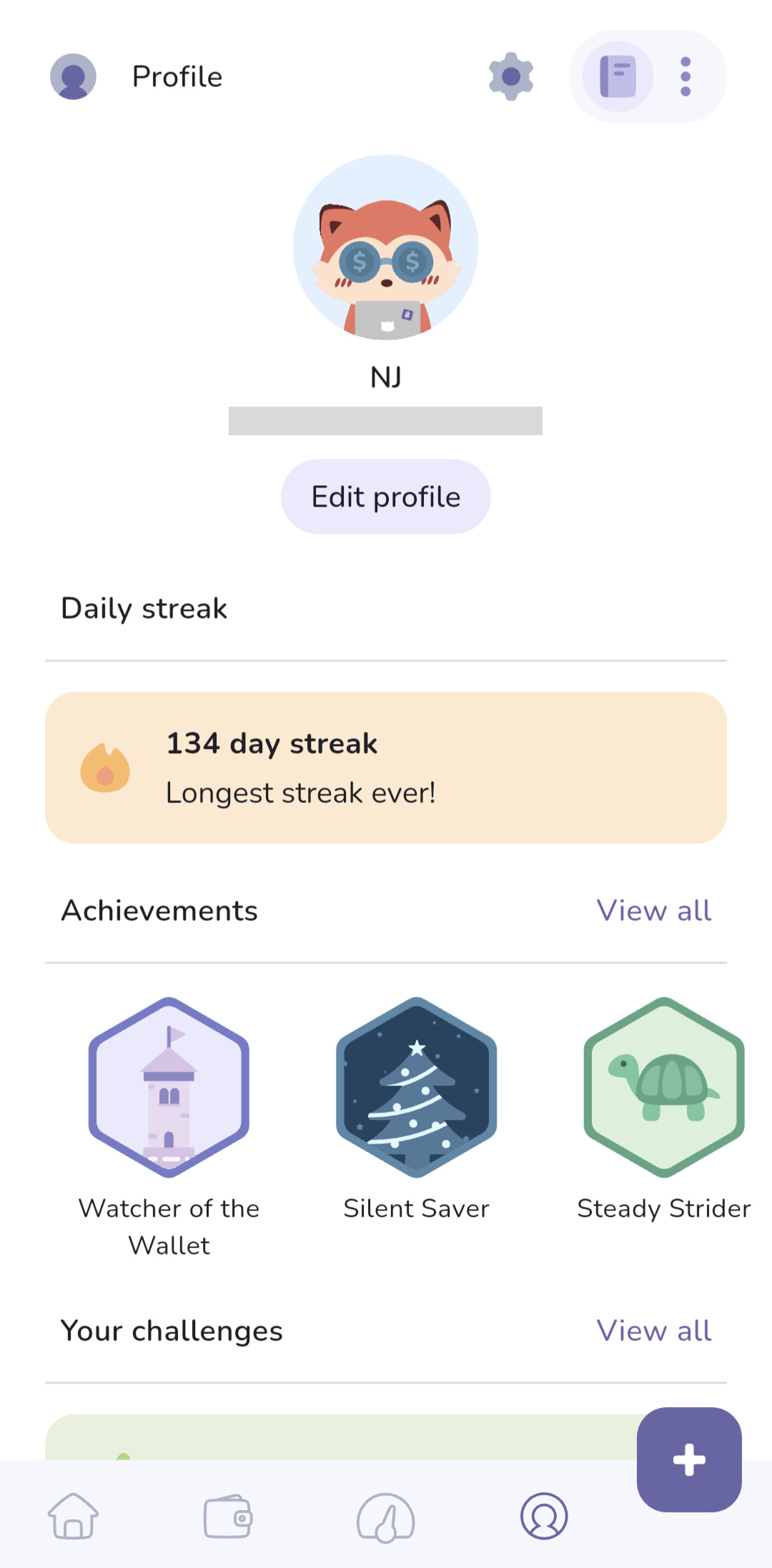
Adding the Savings & Loan Tracker to the bottom nav meant something had to move. The old Challenges & Achievements tab wasn’t getting much love, and cramming in a 5th icon would break our “keep it simple and clutter free” rule.
Why a profile page?
Our long-term vision includes habit building through gamification and social features, and introducing a dedicated profile felt like a meaningful step in that direction.
What changed
New Profile tab: Replaces the old Challenges tab in the nav.
Basic customisation: Users can add their name and choose an avatar (first step toward richer social mechanics).
Challenges & Achievements relocated: All badges now live under the profile, tidy and out of the main flow.
Login-streak counter: We’d been tracking streaks since launching challenges but never surfaced the data. Now it’s front-and-centre (I was also curious to see our streak)!
Part 3: Coming Up in Q3 2025

We’re dedicating this entire quarter to open banking. It’s a big feature, and honestly, I’m not even sure we’ll have it fully launched by the end of Q3.
Let me walk you through some of our thinking and product decisions so far.
Feature Design
The first constraint shaping our open banking feature is that it must integrate cleanly with our existing budgeting experience. That means it needs to work with features like custom categories, offline sync, and the various book types (some include accounts, and some don’t).
At the same time, we don’t want open banking to drastically alter the experience for those who opt in. It should feel like an add-on, not a completely different app.
We also need to remember that 36.7 % of users aren’t very interested in this feature, and some live in countries where open banking won’t be available.
Main limitation: Open banking must feel like an add-on, not a reinvention.
With that in mind, let’s zoom out and revisit the core value of this feature, and how it fits with the overall goal of our app.
Reminder: Our goal is to make budgeting simple and enjoyable, so it’s easier to stick with and build lasting habits.
Open banking can support this in 2 key ways:
Removing one of the biggest obstacles to budgeting: Data entry.
Even though I’ve built the habit of logging expenses the minute they happen, it can still be a drag. Sometimes I enter the wrong amount or account, or miss a surcharge if the EFTPOS terminal doesn’t show it.Removing the need to reconcile with bank statements.
Every so often I compare our app’s numbers with my bank’s data. When the numbers don’t match, tracking down the discrepancy is a real chore. Open banking means our app will automatically mirror your bank feed; no more hunting down that missing $3.50 expense.
The more we thought about this, the clearer it became: We’re building something fundamentally different to other open banking apps — the key difference is the “why”.
Most open banking apps focus on retrospective analysis. They pull in a year’s worth of data and expect you to figure out what to do with it. Their “why” is data analysis.
Our “why” is different: To help you shape your future spending habits.
Side note: Nat and I are already anticipating users will ask us for historical data analysis. We’ll need to communicate our intentions clearly, so we don’t get bombarded with requests and poor reviews.
So what will our open banking feature actually look like?
As you might’ve seen in the mock-ups, the idea is a gamified daily review of your bank transactions:
People choose a time for their daily review.
At that time, we pull in transactions from the bank.
If there’s anything new to review, they get a notification.
The review process involves:
Looking at each transaction.
Customising the note or category (if desired).
Filing it as “want” or “need” (for expenses), or “passive” / “not passive” (for income).
How does this help our users?
No need to remember to log transactions.
Amounts and accounts are always correct.
No more reconciling with bank data.
Builds daily mindfulness by prompting “Did I really need this?” while the purchase is still fresh.
We’ve got a strong idea of what we want to build and why it matters. The real challenge will be in execution: Making the daily review feel fun, not tedious, and setting clear expectations so users know what they’re getting (and not getting).
Our open banking partners
Lastly, a quick note on the 3rd party providers we plan to use for open banking data:
These partners should give us broad coverage across most major banks in the supported countries.
Thank you for joining our quarterly retro. We’re excited about what’s ahead and look forward to helping more people achieve their financial goals in 2025. If you enjoyed this retro, feel free to share it and subscribe so you don’t miss the next one!